What is The Prattler?
The Prattler is the student literary arts magazine at Pratt Institute which has been in publication since 1940. The Prattler is both a print and online publication, typically with 4 print issues per academic year. I was a Co-Creative Director for the Prattler for the 2019/2020 academic year, collaboratively designing the logo, branding, print issues, and social media posts.
Despite its long history, when I became a part of the team, the publication was relatively unknown to the student body. The goal was to create a fresh and bold image for the publication to bring attention to The Prattler and to foster greater engagement with the Pratt community.
The logo type is a modified Reross Quadratic, an Adobe original font based on iconic bauhaus fonts. Modifications were made to the font to create a more bold, balanced, and elegant word mark.
There are two bold brand colors, alongside black and white.


Cult Issue cover

Recovery Issue Feature

Cult Issue Community section

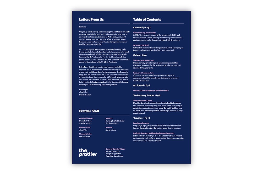
Recovery Issue back cover
Social Media + Promotions
We designed Instagram posts and stories to promote the publication and for our cover art contest. We created matching posters which were put up around campus.

Full Issue
These are the spreads for the Recovery Issue. I was one of two designers responsible for the layout of the print publications. We took the copy from the editorial team and the visuals created by the publication contributors and combined them into the final print issues.
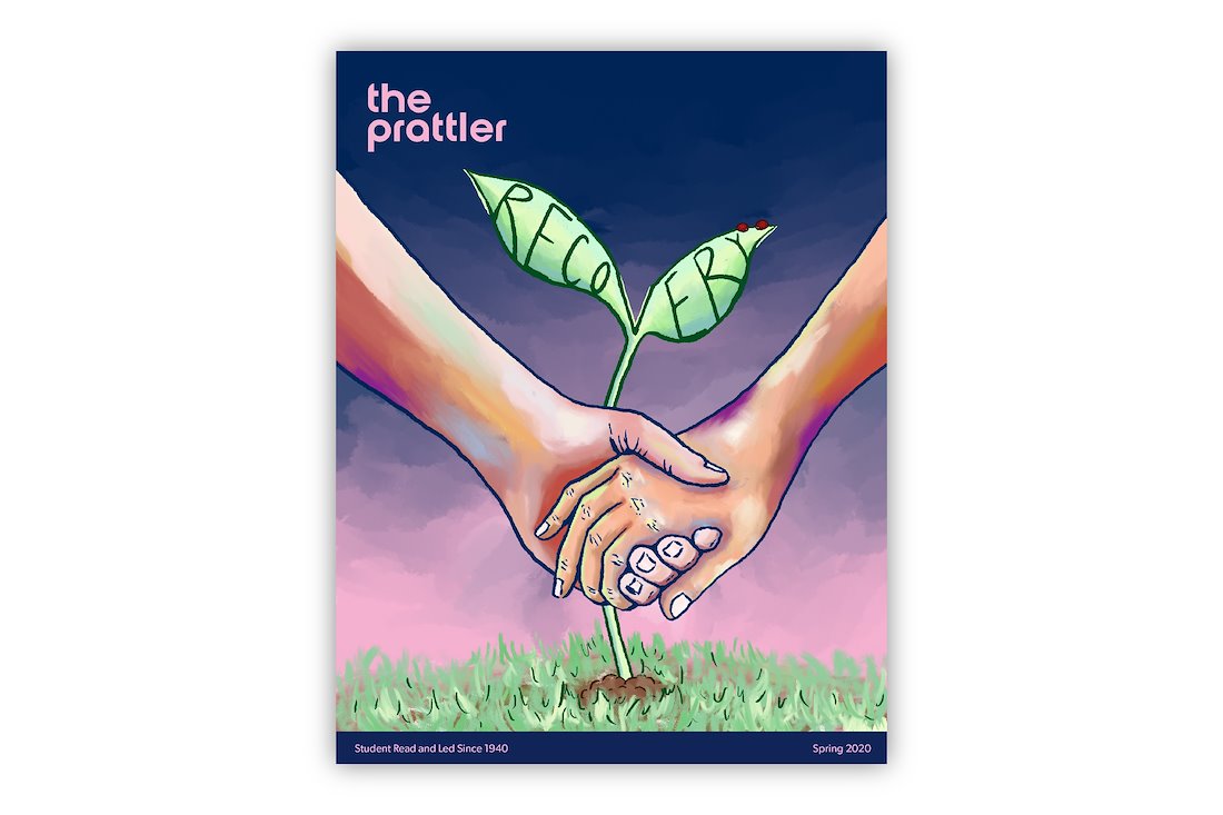
Cover
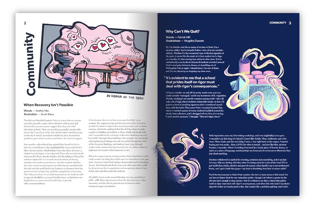
Community Section
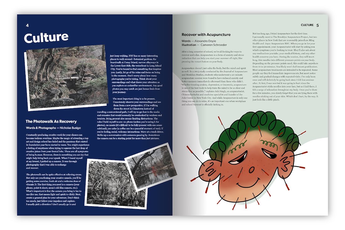
Culture Section
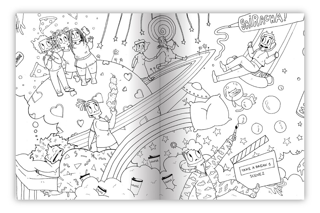
Visual Section (Coloring Page)
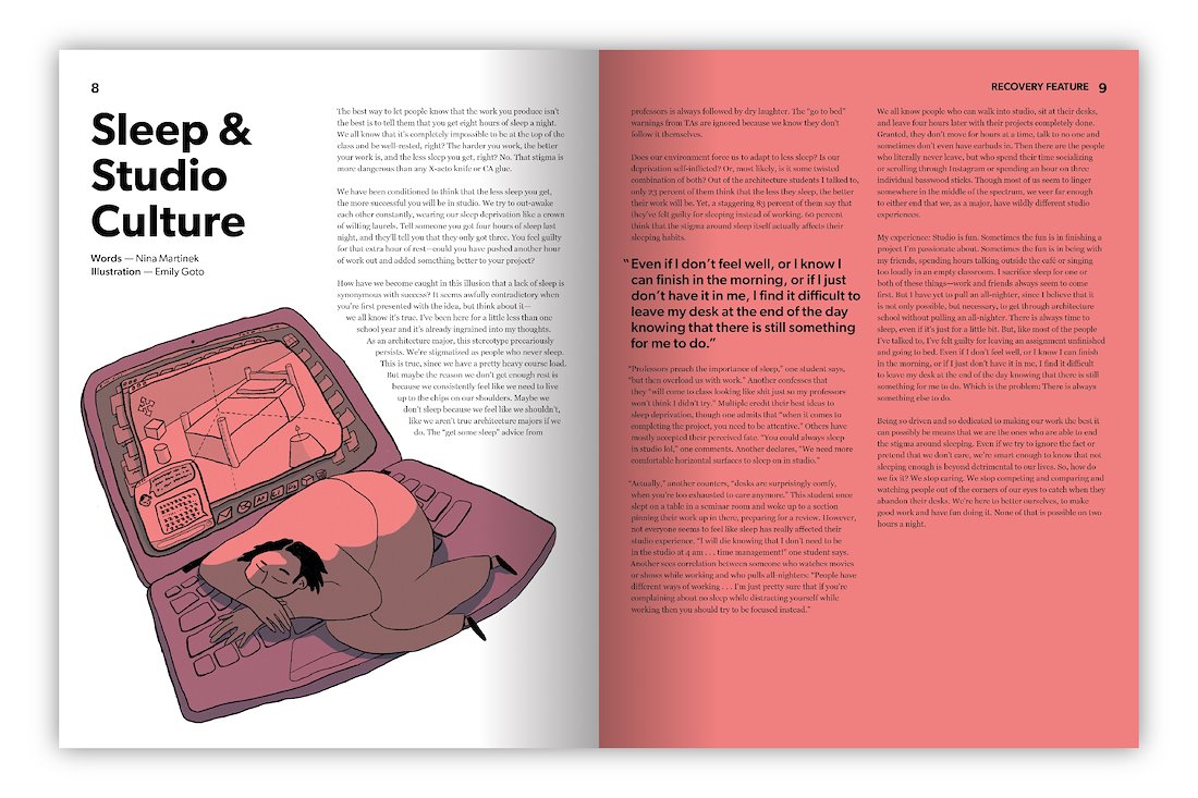
Feature
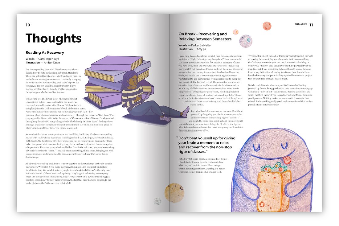
Thoughts Section
Back Cover